
Floating Cart
A cart button that stays pinned to the corner of the screen, so shoppers can open their cart from anywhere.
ShapedCart's Floating Cart is a round cart button that stays in the same spot on the screen while shoppers scroll, with a badge showing how many items are in their cart. Clicking it opens the side cart. It's on by default, in the bottom-right corner.
You'll find its settings at ShapedCart → Side Cart → 2 Triggers → Floating Cart. The card has an on/off switch in its top-right corner, and General and Style tabs.
Turn it on or off
The switch on the ShapedCart Floating Cart card turns the button on or off everywhere on your store. When it's off, the card's settings are hidden. Switch it back on to see them again.
Keep it on if your theme's header doesn't have a cart icon, or if your header scrolls out of view. Then shoppers can always get to their cart, especially on phones. If you'd rather use a cart icon in your menu, turn this off and set up the Menu Cart instead. You can also use both.
General settings
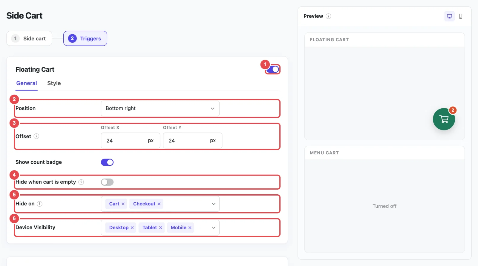
| Setting | What it does | Default |
|---|---|---|
| Position | Which corner or edge of the screen the button sits on | Bottom right |
| Offset | How far the button sits from the edges of the screen | 24px, 24px |
| Show count badge | Shows the number of items in the cart on the button | On |
| Hide when cart is empty | Keeps the button hidden until the shopper adds something | Off |
| Hide on | Pages where the button doesn't appear | Cart, Checkout |
| Device Visibility | Which screen sizes show the button | Desktop, Tablet, Mobile |
Position
ShapedCart's Position setting puts the floating cart in one of four places:
| Position | Where it sits |
|---|---|
| Bottom right | The bottom-right corner. This is where most shoppers expect it. |
| Bottom left | The bottom-left corner. Useful if a chat or "back to top" button already uses the bottom right. |
| Middle right | Halfway down the right edge of the screen. |
| Middle left | Halfway down the left edge of the screen. |
Moved it to the left?
Set the side cart to Slide in from the left as well, so the cart opens from the same side the shopper tapped. See Opening.
Offset
ShapedCart's Offset setting sets how far the floating cart sits from the edges of the screen. It has two values:
- The first (X) is the distance from the left or right edge.
- The second (Y) is the distance from the bottom edge.
Each value has its own unit, px, %, em or rem, so you can mix them. For the Middle positions, the button is always centered vertically, so only the first value (the distance from the side) makes a difference.
Increase the offset if the button covers something, like a chat widget, a cookie banner or your theme's "back to top" arrow. For example, set the second value to 90px to lift it above a cookie bar.
Show count badge
ShapedCart's Show count badge setting adds a small badge to the corner of the button with the number of items in the cart. It counts every unit, so two T-shirts and a hat show 3. The badge updates as soon as the cart changes. When the cart is empty it shows 0, unless you've turned on Hide when cart is empty.
Hide when cart is empty
ShapedCart's Hide when cart is empty setting keeps the floating cart out of sight until the shopper adds their first product. It then appears straight away, with no reload, and hides again if they empty their cart.
Turn this on if you'd rather not show an empty cart to people who are just browsing. Leave it off if you want the button to remind shoppers that the cart is there.
Hide on
ShapedCart's Hide on setting lists the kinds of page where the floating cart doesn't appear. Pick as many as you like:
| Page type | What it covers |
|---|---|
| Cart | Your WooCommerce cart page |
| Checkout | Your WooCommerce checkout page. This doesn't include the thank-you page after an order, which is its own option. |
| Thank you | The order confirmation page shoppers see after they pay |
| My account | All the My Account pages: log in, orders, addresses and account details |
| Blog | Your blog: the posts page, single posts, and category, tag, author and date archives. Your shop, product categories and regular pages aren't included. |
By default, the floating cart is hidden on the Cart and Checkout pages. On the cart page, shoppers are already looking at their cart. On the checkout page, a cart button can pull them away from paying.
On the pages you pick, the button is left out of the page completely, not just hidden with CSS.
Device Visibility
ShapedCart's Device Visibility setting picks which screen sizes show the floating cart:
| Device | Screen width |
|---|---|
| Desktop | Wider than 1024px |
| Tablet | 601px to 1024px |
| Mobile | 600px or narrower |
All three are on by default. A common setup is to show it only on Tablet and Mobile, where the header cart is often hidden in a menu, and rely on the header's cart icon on desktop.
Don't untick all three
If no device is selected, the floating cart won't show anywhere. To turn it off completely, use the switch on the card instead, so it's clear later that it's off on purpose.
Style settings
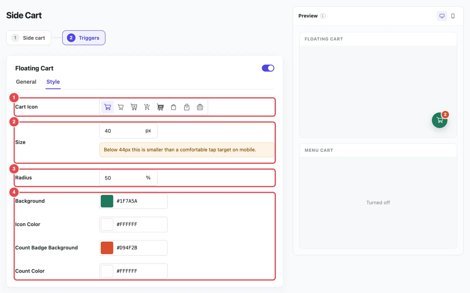
ShapedCart's Style tab on the Floating Cart card controls how the button looks:
| Setting | What it does | Default |
|---|---|---|
| Cart Icon | The icon inside the button. There are eight to choose from, the same set as the side cart's icon. | Cart |
| Size | The button's width and height | 56px |
| Radius | How rounded the button is. 50% makes a circle, 0 a square. | 50% |
| Background | The button's color | #1f7a5a (green) |
| Icon Color | The icon's color | #ffffff (white) |
| Count Badge Background | The count badge's color | #d94f2b (red-orange) |
| Count Color | The number inside the badge | #ffffff (white) |
The icon scales with the button, so a bigger button gets a bigger icon.
Keep it big enough to tap
If you set Size below 44px, you'll see this warning: "Below 44px this is smaller than a comfortable tap target on mobile." Buttons smaller than that are easy to miss with a thumb. 48px to 64px works well for most stores.
The floating cart's colors are separate from the side cart's. To make them match, use the same hex code for the floating cart's Background as for the side cart's Accent color.
How it behaves on your store
- Clicking it opens the side cart. Keyboard users can reach it with Tab and open it with Enter or Space. Screen readers announce it as Open cart.
- It hides while the cart is open, so it doesn't sit on top of the cart, and comes back when the cart closes.
- It stays on top of the page. It's layered above almost everything else, so theme headers and sticky bars won't cover it.
Related
- Menu Cart & Shortcode: a cart icon in your navigation menu
- Opening & Heading: match the side the cart opens from
- Troubleshooting: the floating cart isn't showing