

Side Cart Overview
A quick map of the cart: what each part is called, and which page covers the settings for it.
What the side cart is
The ShapedCart side cart is the panel shoppers see when they open their cart in a WooCommerce store. By default it slides in from the right edge of the screen, and the rest of the page dims behind it. We also call it the drawer; other plugins call the same thing a mini cart, cart drawer or off-canvas cart. You can have it slide in from the left instead, or open as a popup in the middle of the screen. Opening & Heading shows all three.
The cart is ready as soon as the page loads, already filled with the shopper's items, so it opens instantly. When a shopper changes something inside it, the cart and its totals update on the spot, without reloading the page.
Anatomy of the cart
The ShapedCart side cart has eight parts. Here they are from top to bottom, with the settings page for each one.
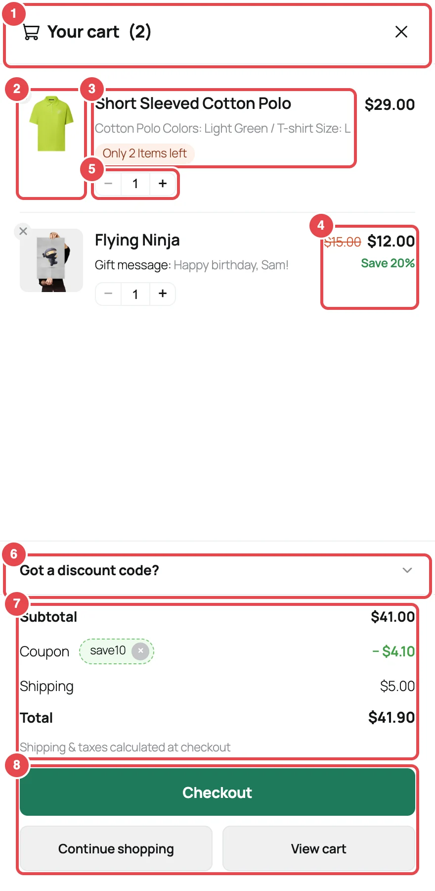
| # | Part | What shoppers see | Settings page |
|---|---|---|---|
| ① | Header | A cart icon, the heading ("Your cart"), the item count, and a close button (×) | Opening & Heading |
| ② | Product image | The product's thumbnail, with a small × in the corner to remove the item | — |
| ③ | Product name and details | The name links to the product page. Under it: the chosen options (Color: Black / Size: M), any add-on details, and a low-stock badge | Cart Items |
| ④ | Price | The line price for that item. On sale items, the original price is crossed out with a savings badge | Cart Items |
| ⑤ | Quantity stepper | − and + buttons, with a box you can type a number into | — |
| ⑥ | Coupon field | A "Got a discount code?" link that opens a code box and an Apply button | Coupon Field |
| ⑦ | Summary | Subtotal, any applied coupons, shipping, the total, and a short note | Cart Summary |
| ⑧ | Buttons | Checkout, plus optional Continue shopping and View cart | Checkout Buttons |
The product image, remove button and quantity stepper are always there, so there's nothing to set for them. Everything else you can switch on or off, relabel, or restyle.
When the cart is empty, parts ② to ⑧ are replaced by a message and a button back to your shop. Empty State covers that. The colors, width and corner rounding of the whole panel are on Layout & Colors.
Applied coupons always show
Once a shopper applies a coupon, it appears in the summary with its discount and a × to remove it, even if you've turned the coupon field off. That way shoppers can always see what's been taken off their order.
How shoppers open and close it
Shoppers can open the ShapedCart side cart in three ways:
- By adding a product. The cart opens by itself after every add, so shoppers know it worked. This is auto-open, and it's on by default.
- With the floating cart. That's the cart button pinned to a corner of the screen, on by default.
- With the menu cart. That's the cart icon in your navigation menu, off until you turn it on.
To close it, they can click the × in the header, click the dimmed page behind the cart, or press Esc. The cart also closes when a shopper clicks Continue shopping, if you've set that button to close the cart.
While the cart is open, the page behind it can't scroll, and the floating cart hides so it doesn't sit on top of the panel. Both come back when the cart closes.
Keyboard and screen-reader friendly
When the cart opens, keyboard focus moves into it and stays there until it closes. Then focus goes back to whatever opened it. See Accessibility.
Where the settings live
All of the side cart's settings are in one place: ShapedCart → Side Cart → 1 Side cart. The card there has two tabs.
| Tab | Section | Docs page |
|---|---|---|
| General | Basic Settings | Opening & Heading |
| Cart Items | Cart Items | |
| Coupon Field | Coupon Field | |
| Cart Summary | Cart Summary | |
| Checkout Section | Checkout Buttons | |
| Empty State | Empty State | |
| Style | Layout, Colors | Layout & Colors |
As you change settings, the preview on the right of the screen shows the result straight away. Remember to click Save changes when you're done. Admin Screen Tour explains the preview and saving.
Related
- Opening & Heading: start here
- Floating Cart and Menu Cart: ways to open the cart
- Admin Screen Tour