

Layout & Colors
Make the side cart look like part of your store: its size, its corners, its icon and its colors.
ShapedCart's Style tab controls how the WooCommerce side cart looks. You'll find it at ShapedCart → Side Cart → 1 Side cart → Style. It has two sections, Layout and Colors. The preview on the right updates as you go, so you can try things before you save.
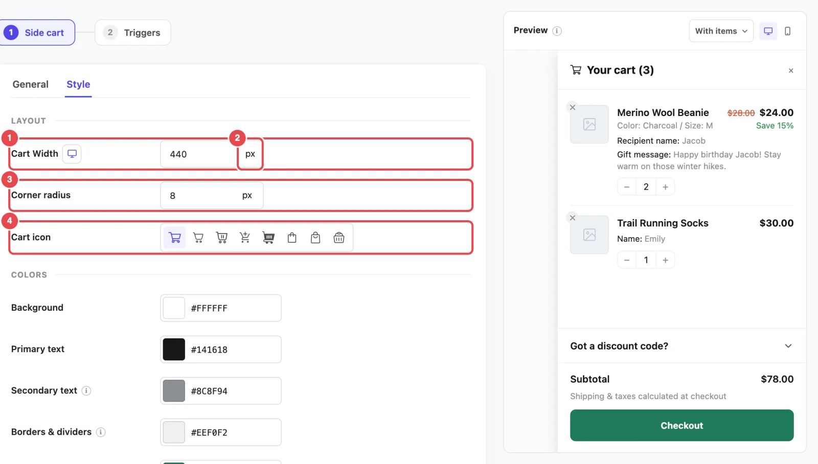
At a glance
| Setting | What it does | Default |
|---|---|---|
| Cart Width | How wide the cart is, set separately for desktop, tablet and mobile | 440px / 400px / 360px |
| Corner radius | How rounded the buttons, fields, product images and center popup are | 8px |
| Cart icon | The icon in the cart heading and the empty cart. Appears when Show cart icon in heading is on. | Cart |
| Colors | Eight colors for the cart's background, text, borders, buttons and prices | See Colors |
Cart Width
ShapedCart's Cart Width setting sets how wide the side cart is. It has three values, one each for desktop, tablet and mobile, because a width that looks right on a laptop can be far too wide for a phone.
To set them:
- Click the desktop, tablet or mobile icon next to Cart Width.
- Type a width for that screen size, and pick a unit.
- Repeat for the other two sizes.
Each size applies to these screen widths:
| Device | Screen width | Default |
|---|---|---|
| Desktop | Wider than 1024px | 440px |
| Tablet | 601px to 1024px | 400px |
| Mobile | 600px or narrower | 360px |
You can use two units:
- px sets an exact width, like
440px. This is best for most stores, because the cart stays the same size however wide the screen is. - % sets a share of the screen width, like
30%. The cart then grows and shrinks with the browser window.
Changing the unit keeps the number
If you switch from px to %, the number stays the same, so 440px becomes 440%. Type a new number after you change the unit.
The cart is never wider than the screen. On a phone narrower than your mobile width, it fills the screen from edge to edge. The same widths apply whether the cart slides in from the side or opens as a center popup.
A good starting point
Between 380px and 480px on desktop suits most stores. That's wide enough for long product names and prices, and it still leaves the page visible behind the cart. On mobile, 100% makes the cart fill the screen, which some shoppers find easier to use.
Corner radius
ShapedCart's Corner radius setting controls how rounded the corners are on everything inside the cart:
- the checkout, Continue shopping, View cart and empty-cart buttons
- the coupon code box and its Apply button
- the quantity stepper
- product images
- the cart panel itself, when it opens as a center popup
The side-sliding cart always sits flush against the edge of the screen, so its own corners stay square.
Use 0 for sharp, square corners, 4px–8px for a gentle curve, or 20px and up for pill-shaped buttons. You can pick px, %, em or rem as the unit, but px is the most predictable.
Match your theme's buttons
Look at your theme's "Add to cart" button and use the same rounding. When the cart's buttons match the rest of your store, the cart feels like part of it.
Cart icon
ShapedCart's Cart icon setting picks the icon shown next to the cart heading and at the top of the empty cart. Click an icon to choose it. There are eight: Cart (the default), Cart (fine line), Cart (slim), Cart with plus, Cart with items, Shopping bag, Basket (outline) and Basket with lines. Hover over an icon in the picker to see its name.
This setting only appears while Show cart icon in heading is on. See Opening & Heading. If you turn the heading icon off, the empty cart still uses the icon you picked here.
The floating cart and menu cart each have their own icon setting, so you can use a different icon for each. Most stores use the same one everywhere.
Colors
ShapedCart's Colors section sets every color in the side cart, so you can match it to your brand. Here's what each one colors:
| Setting | What it colors | Default |
|---|---|---|
| Background | The cart panel's background | #ffffff (white) |
| Primary text | Product names, prices, the close button, quantities, and most other text | #141618 (near black) |
| Secondary text | Variation and add-on details, the empty cart message and icon, the shipping note, the coupon code box's hint text, and the remove × on product images | #8c8f94 (grey) |
| Borders & dividers | The lines between items, above and below the header and footer, and around the quantity stepper, coupon box and Continue shopping / View cart buttons | #eef0f2 (light grey) |
| Accent | The checkout, Apply and empty-cart buttons, and the focus outline keyboard users see | #1f7a5a (green) |
| Accent text | The text on those accent-colored buttons | #ffffff (white) |
| Regular price | The crossed-out original price on sale items, and the remove × when a shopper hovers over it. Appears when Show regular price is on. | #d94f2b (red-orange) |
| Savings text | The savings badge on sale items. Appears when Show savings is on. | #2f8f4e (green) |
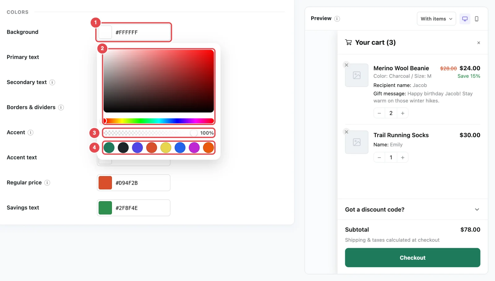
Picking a color
Click a color's swatch to open the color picker. In it, you can:
- drag in the large square to pick a shade, and along the rainbow bar to change the hue
- use the opacity slider to make the color see-through (0% is invisible, 100% is solid)
- click one of the quick swatches for a ready-made color
Or type a hex code, like #4f46e5, straight into the box next to the swatch.
Going back to a default color
There's no reset button for a single color. To undo one, type its default hex code from the table above. To put every setting back to its default, use Reset on the Settings tab.
Keep it readable
Colors that look fine to you can be hard to read for shoppers with low vision, or on a phone in sunlight. Two pairs matter most:
- Primary text on Background
- Accent text on Accent, which is your checkout button
Aim for strong contrast: dark text on a light background, or white text on a deep color. If you're not sure, paste both hex codes into a free contrast checker and look for a ratio of at least 4.5 to 1, the level WCAG recommends for normal text. Accessibility has more tips.
What the colors don't change
- Fonts. The cart uses your theme's font, so it matches the rest of your store.
- The dimmed overlay behind the cart. It's a fixed dark tint.
- Coupon colors. The discount amount on an applied coupon is always green, and coupon error messages are always red.
- The floating cart and menu cart. They have their own color settings on the Triggers step. See Floating Cart and Menu Cart.
Want to change something that isn't a setting, like the overlay or the font size? Custom CSS shows how.
Related
- Opening & Heading: where the cart opens and the heading icon switch
- Floating Cart: the floating cart's own style settings
- Custom CSS: go beyond the built-in settings